Explore the Data

Data set description.

Overview

This page provides plots and figures describing the contents of the f(l)usion data set.

Data description:

Show code
library(tidyverse)
options(dplyr.summarise.inform = FALSE, show_col_types = FALSE)

get_fusion <- function(url) {
  library(readr)
  df <- read_csv(url)
  return(df)
}

hub_url <- "https://github.com/JMHumphreys/flusion/raw/main/flusion/flusion_v2.csv"

myFlusion <- as.data.frame(get_fusion(hub_url))


head(myFlusion)
date year epiweek abbreviation location location_name q_0.025 q_0.25 q_0.50 q_0.75 q_0.975 age_class
2010-10-09 2010 40 AL 01 Alabama 0.13 0.43 0.80 1.48 4.83 overall
2010-10-09 2010 40 AK 02 Alaska 0.04 0.14 0.26 0.48 1.58 overall
2010-10-09 2010 40 AZ 04 Arizona 2.68 8.71 16.12 29.72 93.15 overall
2010-10-09 2010 40 AR 05 Arkansas 0.08 0.25 0.47 0.87 2.82 overall
2010-10-09 2010 40 CA 06 California 1.81 5.89 10.93 20.24 64.55 overall
2010-10-09 2010 40 CO 08 Colorado 1.12 3.65 6.77 12.55 40.19 overall

Data attributes:

  • date: Date of the reported epidemiological week (epiweek) based on a Saturday start.
  • year: Year of estimate
  • epiweek: The epidemiological week
  • abbreviation: U.S. State or Territory abbreviation.
  • location: Numeric location code based on FIPS.
  • location_name: Name of U.S. State or Territory.
  • age_class: Nine age group classes and an “overall” category for totals (all ages). 
  • Columns beginning with q_ provide the 0.025, 0.25, 0.5, 0.75, and 0.975 quantiles for estimated flu hospitalizations.

Select Data

The age_class column defines data subsets that can be partitioned for analysis.

Show code
unique(myFlusion$age_class)
 [1] "overall"  "0-4 yr"   "18-29 yr" "30-39 yr" "40-49 yr" "5-17 yr" 
 [7] "50-64 yr" "65-74 yr" "75-84 yr" "85+"     

2022-2023 Season by Age

Show code
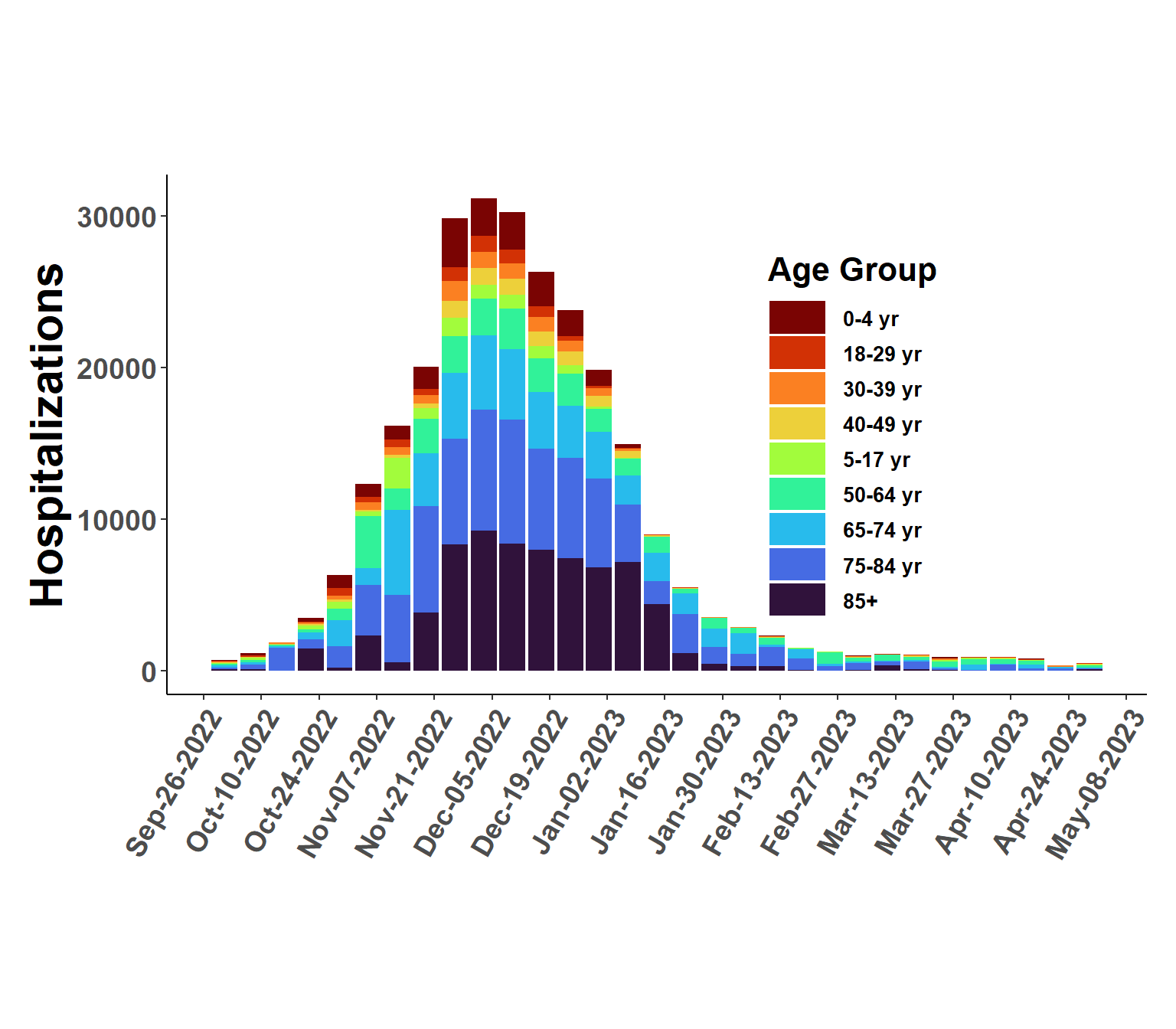
season2022_23 <- myFlusion %>% 
  filter(age_class != "overall",
         date >= as_date("2022-10-01"))

ggplot(season2022_23, aes(date, q_0.50, fill=age_class), col = "transparent") +
  geom_bar(position="stack", stat="identity") +
   viridis::scale_fill_viridis("Age Group",
                             discrete=T,
                             option = "turbo",
                             direction = -1,
                             na.value = "white") +
    scale_x_date(date_breaks = "2 week", date_labels = "%b-%d-%Y") +
    xlab(" ") +
    ylab("Hospitalizations") + 
    ggtitle(" ") +
    theme_classic() +
    theme(plot.margin = unit(c(2,0.5,2,0.5), "cm"),
      panel.grid.minor = element_blank(),
      panel.grid.major = element_blank(),
      panel.background = element_blank(),
      plot.background = element_blank(),
      panel.border = element_blank(),
      legend.title = element_text(size = 16, face = "bold", hjust=0.5),
      legend.text = element_text(size=10, face="bold"),
      strip.text = element_text(size=16, face="bold"),
      strip.background = element_blank(),
      legend.position = c(0.7, 0.5),
      legend.direction = "vertical",
      legend.key.width = unit(2,"line"),
      axis.text.y = element_text(face="bold", size=14),
      axis.text.x = element_text(face="bold", size=14, angle = 60, hjust=1),
      axis.title.x = element_text(size=22, face="bold"),
      axis.title.y = element_text(size=22, face="bold"),
      plot.title = element_text(size=25, face="bold", hjust=0.5)) 

Plot National Totals

Show code
natl_sums <- myFlusion %>%
  filter(age_class == "overall") %>%
  group_by(date) %>%
  summarise(Q0.25 = sum(q_0.25),
            Q0.50 = sum(q_0.50),
            Q0.75 = sum(q_0.75))


ggplot(natl_sums, aes(date, Q0.50)) +  
  geom_ribbon(aes(ymin=Q0.25, ymax=Q0.75),fill="steelblue", alpha = 0.8) +
  geom_line(linewidth = 0.5) +
  scale_x_date(date_breaks = "6 month", date_labels = "%b-%Y") +
  ylab("Estimated Hospitalizations") +
  xlab(" ") +
  theme_minimal() +
  theme(plot.margin = unit(c(2,0.1,2,0.1), "cm"),
        panel.grid.minor = element_line(color = "gray90", linewidth = 0.25, linetype = 1),
        panel.grid.major = element_line(color = "gray60", linewidth = 0.5, linetype = 1),
        panel.background = element_blank(),
        plot.background = element_blank(),
        legend.position="none",
        legend.text = element_text(size=12, face="bold"),
        legend.title = element_text(size=16, face="bold"),
        axis.title.x =  element_text(size=16, face="bold"),
        axis.title.y = element_text(size=16, face="bold"),
        axis.text.x =  element_text(size=14, face="bold", angle=60, hjust=1),
        axis.text.y = element_text(size=12, face="bold"),
        plot.title = element_text(size=22, face="bold"))

Plot States

Show code
set.seed(123)
random_states <- sample(myFlusion$abbreviation, size=4)

states_plot <- myFlusion %>%
   filter(age_class == "overall") %>%
  filter(abbreviation %in% random_states)

ggplot(states_plot, aes(date, q_0.50)) +  
  geom_ribbon(aes(ymin=q_0.025, ymax=q_0.975),fill="steelblue", alpha = 0.3) +
  geom_ribbon(aes(ymin=q_0.25, ymax=q_0.75),fill="steelblue", alpha = 0.5) +
  geom_line(linewidth = 0.5) +
  scale_x_date(date_breaks = "6 month", date_labels = "%b-%Y") +
  facet_grid(rows = vars(location_name), scales = "free_y") +
  ylab("Estimated Hospitalizations") +
  xlab(" ") +
  theme_minimal() +
  theme(plot.margin = unit(c(0.1,0.1,0.1,0.1), "cm"),
        panel.grid.minor = element_line(color = "gray90", linewidth = 0.25, linetype = 1),
        panel.grid.major = element_line(color = "gray60", linewidth = 0.5, linetype = 1),
        panel.background = element_blank(),
        plot.background = element_blank(),
        strip.text = element_text(size=14, face="bold"),
        strip.background = element_blank(),
        legend.position="none",
        legend.title = element_text(size=16, face="bold"),
        axis.title.x =  element_text(size=16, face="bold"),
        axis.title.y = element_text(size=16, face="bold"),
        axis.text.x =  element_text(size=12, face="bold", angle=60, hjust=1),
        axis.text.y = element_text(size=12, face="bold"),
        plot.title = element_text(size=22, face="bold"))

Shorter Term

Show code
set.seed(111)
random_states <- sample(myFlusion$abbreviation, size=4)

random_yr <- sample(myFlusion$year, size=1)


states_plot_yr <- myFlusion %>%
   filter(age_class == "overall") %>%
  filter(abbreviation %in% random_states,
         year == random_yr | year == (random_yr + 1))

ggplot(states_plot_yr, aes(date, q_0.50)) +  
  geom_ribbon(aes(ymin=q_0.025, ymax=q_0.975),fill="steelblue", alpha = 0.3) +
  geom_ribbon(aes(ymin=q_0.25, ymax=q_0.75),fill="steelblue", alpha = 0.5) +
  geom_line(linewidth = 0.5) +
  scale_x_date(date_breaks = "6 month", date_labels = "%b-%Y") +
  facet_grid(rows = vars(location_name), scales = "free_y") +
  ylab("Estimated Hospitalizations") +
  xlab(" ") +
  theme_minimal() +
  theme(plot.margin = unit(c(0.1,0.1,0.1,0.1), "cm"),
        panel.grid.minor = element_line(color = "gray90", linewidth = 0.25, linetype = 1),
        panel.grid.major = element_line(color = "gray60", linewidth = 0.5, linetype = 1),
        panel.background = element_blank(),
        plot.background = element_blank(),
        strip.text = element_text(size=14, face="bold"),
        strip.background = element_blank(),
        legend.position="none",
        legend.title = element_text(size=16, face="bold"),
        axis.title.x =  element_text(size=16, face="bold"),
        axis.title.y = element_text(size=16, face="bold"),
        axis.text.x =  element_text(size=16, face="bold"),
        axis.text.y = element_text(size=12, face="bold"),
        plot.title = element_text(size=22, face="bold"))